Mobile Support
Using Polotno on mobile/touch devices and forcing compact mode
Does Polotno support mobile and touch devices?
Yes. You can use it on mobile and touch devices to create beautiful designs. Polotno adapts to mobile and touch environments, ensuring a smooth, optimized design experience on any screen size.
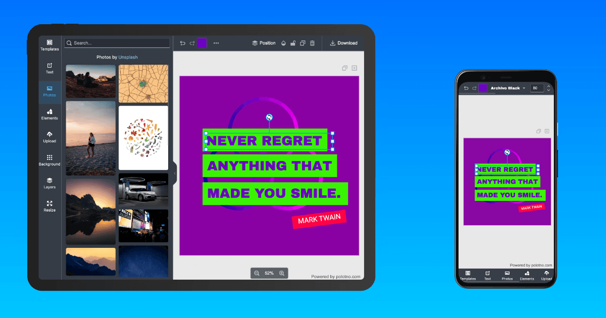
Note: Polotno SDK is primarily designed to work in web environments (not native apps). However, you can still use it in your app where a WebView is available.
Touch gestures
Touch handling is built in, with no configuration required:
- Pinch to zoom. A two-finger pinch on the workspace zooms around the pinch centre, so the point between your fingers stays put rather than the view jumping to the canvas centre.
- Drag suppression during a pinch. As soon as a second touch lands, element dragging stops, so a zoom gesture never nudges the element underneath it.
- Timeline touch support. The pages timeline is touch-driven, including scrubbing and reordering.
Pinch zoom is always enabled on touch devices and shares the same zoom state as store.setScale(), so a programmatic zoom and a gesture zoom stay in sync.
How to toggle mobile mode on large screens?
In some cases you may want to force compact/mobile view on a large screen (e.g., when embedding the editor in a sidebar). Add the polotno-mobile class to any parent container of the Polotno editor, such as the body tag:
<body class="polotno-mobile">
  <div id="root"></div>
</body>