Customizations
Learn what you can customize in the Polotno editor interface and functionality
First, let's talk about the user interface.
The Polotno editor has several main components:
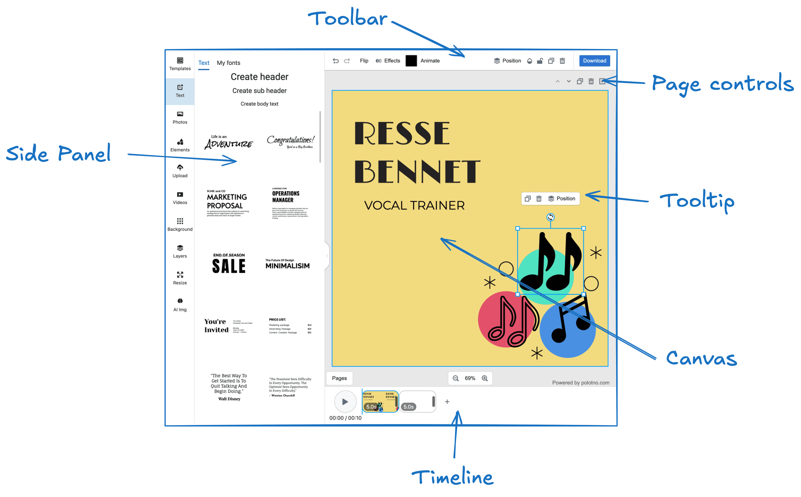
Full Control of the Side Panel
You have complete control over the Side Panel. You can remove the default panels, add your own, and customize their content entirely. For instance, you can create a panel that loads images directly from your backend. Check out the Side Panel Overview for more information.
Toolbar, Page Controls, and Tooltip Customization
You can modify, remove, or add controls and buttons in the Toolbar, Page Controls, and Tooltip, allowing you to tailor the interface to your needs.
Timeline Customization
Currently, the Timeline component is not customizable. However, you can remove it and implement your own version using the Store API.
Canvas Customization
The Canvas component offers several style customization options. You can modify properties like background color and selection tool colors. For more options, refer to the Workspace Documentation.
General Style Customization
You can also use CSS to overwrite and customize the general styles of the editor.
Data Loading and Export
You have full control over how data is loaded into the editor, saved, and exported.
For example:
- Load custom templates or a specific user's design from your backend.
- Save a JSON file to a local computer with a button click.
- Automatically send requests to your backend with design data on any changes.
- Upload design previews or exports to an S3 bucket.
The Store API allows you to implement all of these features, ensuring your data flow fits seamlessly with your infrastructure.
Building custom UI with polotno/primitives
When you add your own panels, toolbar buttons, or dialogs, you can build them with the same components the editor uses, so they match the default UI out of the box. They're exposed at polotno/primitives.
import { Button, Input, Select, Popover, Tooltip, Slider, Tabs } from 'polotno/primitives';

const MyPanel = () => (
  <div>
    <Input placeholder="Search…" />
    <Button onClick={() => {}}>Add</Button>
  </div>
);
Available primitives include Button, Input, Textarea, Select, Popover, Tooltip, Slider, Tabs, Dialog, Switch, NumericInput, and more. They follow the editor's theme, including dark mode.
Overriding icons
You can swap any editor icon (or a whole pack) by semantic name with setIcons. See Editor Configuration → How to override icons?.